Styling the application
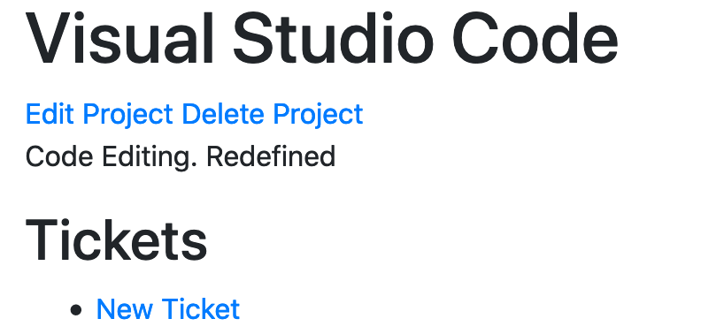
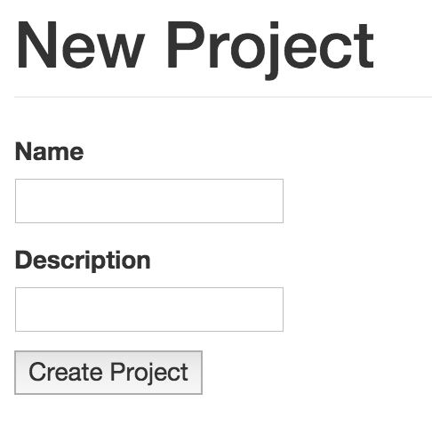
The application is currently looking a bit plain:
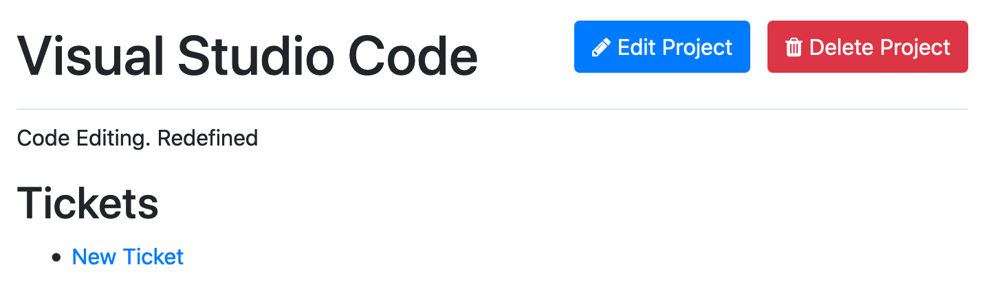
We can change this by using Bootstrap[1], which is a front-end CSS and JavaScript framework that comes with a collection of styles that we can apply to our application. When we use these styles, our new project form will turn into this:
You’ll notice the asterisk next to the "Name" field here. This is because the
"Name" field is a required field, and that’s because we have a validation on our
Project model for the presence of this field. We’re going to be using a gem called bootstrap_form to style our form in this way.
The bootstrap_form gem not only makes our form neater, but also makes the code for generating a form much simpler. Whereas we have this now:
<div>
  <%= form.label :name %>
  <%= form.text_field :name %>
</div>

<div>
  <%= form.label :description %>
  <%= form.text_field :description %>
</div>
The bootstrap_form gem allows us to write this instead:
<%= f.text_field :name %>
<%= f.text_field :description %>
The Bootstrap framework also lends itself to more than just forms. We’ll be using it in this section to style the flash messages from our application, as well as adding a navigation bar to the top of the screen.
Let’s get started!
Installing Bootstrap
The first thing that we need to do is to install the bootstrap gem,
which comes with Sass versions of the Bootstrap assets. Sass bills itself as "CSS with Superpowers", and we’ll be using it to write our CSS for our application.
This bootstrap gem is the recommended way to install Bootstrap in to a Rails application. Let’s add this gem to our application now by running this command:
bundle add bootstrap -v {bootstrap_version}
To add Bootstrap’s styles to your application, you’ll need to make your main
application stylesheet a Sass file, by renaming
app/assets/stylesheets/application.css to application.css.scss, adding the
.scss extension to the end of the filename. This extension tells the asset pipeline that this file should be processed using the Sass pre-processor, before it’s presented as a CSS file. This pre-processing will convert any Sass-specific code to CSS code, so that browsers can understand it.
Let’s replace the entire contents of that application.css.scss file
with this:
@import "bootstrap";This line imports all of Bootstrap’s CSS components.[2] With these assets now imported, we can restart our server and go to http://localhost:3000 to see some changes immediately:
The styling of our home page has changed to reflect Bootstrap’s default
styling! That was easy. It’s all hard up against the left side of the page
though. We can fix this by wrapping all of the content in a container in
app/views/layouts/application.html.erb:
<body>
  <div class="container-fluid">
    <% flash.each do |key, message| %>
      <div><%= message %></div>
    <% end %>

    <%= yield %>
  </div>
</body>
This element will shift the content away from the left-hand side of the page by using Bootstrap’s container-fluid class[3]:
Improving the page’s header
Next up, let’s make the header section of our page look a little bit nicer,
starting with the main heading. Bootstrap provides utility classes[4] that
we can use to give a bit of style, so let’s wrap these around the h1 in
app/views/projects/index.html.erb.
<div class="pb-2 mt-4 mb-2 border-bottom">
  <h1>Projects</h1>
</div>
It adds some nice spacing around the important header, and an underline. So far so good. Now we can look at the actions we can take on this page - the most obvious action is to create a new project, so we’ll make our "New Project" link stand out.
Ultimately, we want to make the "New Project" be part of the page header, and we’ll put it on the right hand side to give the page a bit of balance.
In app/views/projects/index.html.erb, change the code from this:
<div class="pb-2 mt-4 mb-2 border-bottom">
  <h1>Projects</h1>
</div>

<%= link_to "New Project", new_project_path %>
To this:
<div class="pb-2 mt-4 mb-2 border-bottom">
  <h1>Projects</h1>

  <ul class="actions">
    <li><%= link_to "New Project", new_project_path,
      class: "btn btn-success" %></li>
  </ul>
</div>
The relevant page actions is now part of the header, in a list (as some pages
will have multiple actions to take, such as edit or delete). And adding the two
btn btn-success classes to any HTML element will change its appearance into a
button, like this:
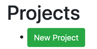
The btn-success turns it into a specific type of button.[5] We can
add a little bit more flair to this button by adding an icon from the Font
Awesome project[6], turning it into this:
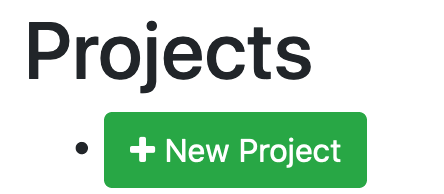
To get to that newest, best looking version of the button, let’s add the
font-awesome-rails gem to our application with this command:
bundle add font-awesome-rails -v 4.7.0.6
Just like the bootstrap gem, the font-awesome-rails gem also comes
with some assets. The assets from the font-awesome-rails gem give us a whole
range of icons, shown on the Font Awesome icons page:
http://fortawesome.github.io/Font-Awesome/icons/. To use these icons, we must
first run bundle and restart the Rails server. Then we’ll need to
add another @import line to app/assets/stylesheets/application.css.scss,
after the bootstrap line that you have already:
font-awesome to your application.css.scss
@import "bootstrap";
@import "font-awesome";
To add the icon to the button, you can use the fa_icon helper — this comes from the font-awesome-rails gem — as part of the
link in app/views/projects/index.html.erb, like this:
<li><%= link_to fa_icon("plus") + " New Project", new_project_path,
  class: "btn btn-success" %></li>
It will now look like this:
Positioning actions with custom CSS
This header looks a bit weird. What we’d like it to be is this:
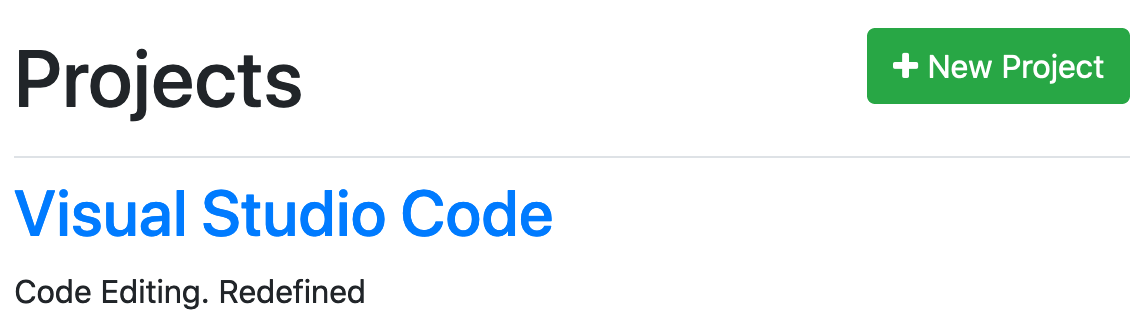
The header over there on the left, and the actions over there on the right.
To do this, we can add a couple of lines of CSS to app/assets/stylesheets/application.css.scss:
.page-header {
  @extend .pb-2, .mt-4, .mb-2, .border-bottom, .row;

  h1,
  h2,
  h3,
  h4,
  h5,
  h6 {
    @extend .col-sm-12, .col-md-6;
  }

  ul.actions {
    @extend .col-sm-12, .col-md-6;
    @extend .list-unstyled, .list-inline;

    li {
      @extend .list-inline-item;
    }

    text-align: right;
  }
}
This does a couple of things:
-
Provides us with a single class that we can use to apply all the page header utility styles in
.page-header. We will change our view shortly to use this class. -
Uses Bootstrap’s
.rowand.col-*classes to specify the widths of the headers and actions. This will ensure that they display neatly on all screen sizes. When we usecol-sm-12, it says that on small screens that element should take up 12 columns (the entire screen). Withcol-md-6, this means on medium screens (and above) those same elements will only take up 6 columns, half the screen. -
Removes the dot to the left of the button with
.list-unstyledonul.actions. -
Makes all potential actions inline with
.list-inline. The default behaviour is to display each of them on their own line. -
Moves all the content in
ul.actionsto the right withtext-align: right, pushing all actions to the right-hand-side of the screen.
When we make these changes to application.scss, we’ll need to also change the class used in app/views/projects/index.html.erb:
<div class="pb-2 mt-4 mb-2 border-bottom">This should now be changed to:
<div class="page-header">We’ve configured our CSS to apply the same utility classes for us (by using @extend), so we do not have to do that in this tag any longer.
With these changes in place, when we refresh the page we’ll see our new header:
Applying the style elsewhere
You can apply similar styling to the views for the new, edit and show
actions. The new and edit views have no action menus, so their page headers
can simply be tweaked to add the .page-header wrapper element:
<div class="page-header">
  <h1>New Project</h1>
</div><div class="page-header">
<h1>Edit Project</h1>
</div>Improving the show view
Improving the ProjectsController#show view is a little more work, as it has links of different types. One
link edits; the other deletes. The header section of the page currently looks
like this:
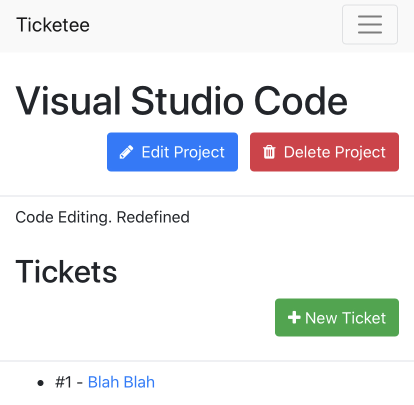
Let’s change that header to look like this:
<div class="page-header">
  <h1><%= @project.name %></h1>

  <ul class="actions">
    <li><%= link_to fa_icon("pencil") + " Edit Project",
      edit_project_path(@project), class: "btn btn-primary" %></li>
    <li><%= link_to fa_icon("trash") + " Delete Project",
      project_path(@project),
      method: :delete,
      data: { confirm: "Are you sure you want to delete this project?" },
      class: "btn btn-danger" %></li>
  </ul>
</div>
Like before, there’s a <div class="page-header"> around the header, and our
links are now in a list of action links. We’ve chosen different button styles
for this page - btn-primary for editing, and btn-danger for deleting.
btn-danger links are bright red, indicating a dangerous action. There’s also
some appropriate icons for the links.
These links will now be styled nicely:
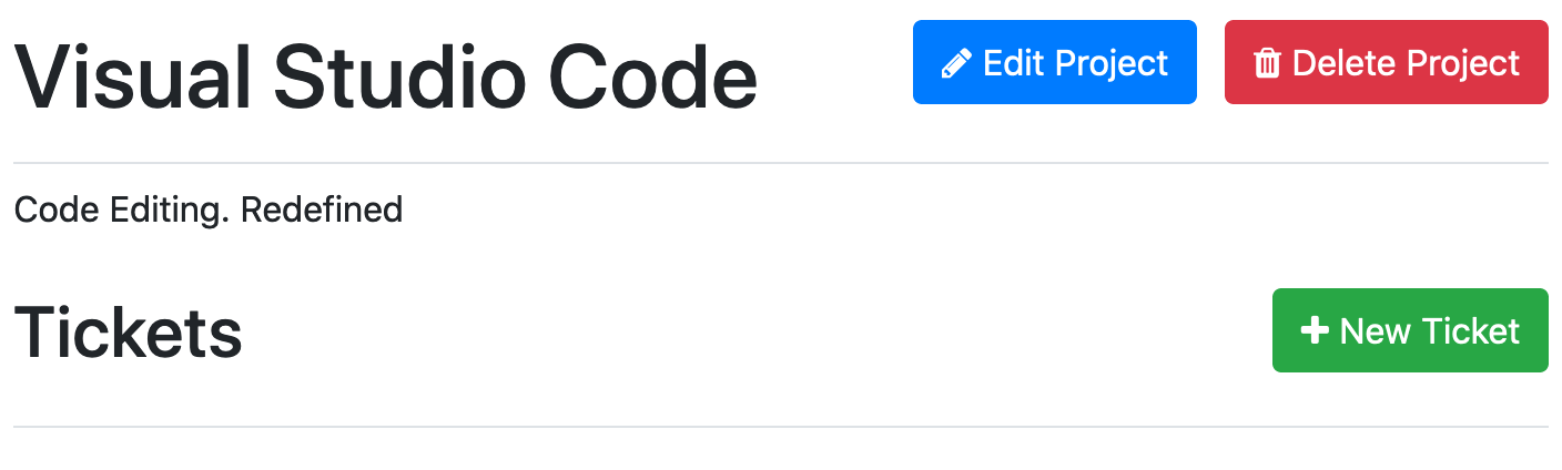
Further down on the page, we have the tickets area. Let’s change this header now too:
<header class="page-header">
  <h2>Tickets</h2>

  <ul class="actions">
    <li>
      <%= link_to fa_icon("plus") + " New Ticket",
        new_project_ticket_path(@project),
        class: "btn btn-success" %>
    </li>
  </ul>
</header>
This will make the whole page look great:
Now that’s all looking a lot better, but we can do a lot better in our code!
Semantic styling
As it stands at the moment, whenever we have a "New", "Edit" or "Delete" link
in our application, we’re going to have to add all this markup around it with
the fa_icon and the class attribute. Rather than repeating all that
markup, we can use semantic styling. All the "New" links are going to look
the same way, all the "Edit" links are going to look the same way and all the
"Delete" links are going to look the same way, so why not style them all in an
easier fashion? Plus, if we decide later down the track that all "New" links
should now be styled differently, we’ll only have to update the code in one
place - in the stylesheet. Very DRY of us.
Styling buttons
To start fixing this, we can go back to app/views/projects/index.html.erb
and change the "New Project" link to this:
<%= link_to "New Project", new_project_path, class: "new" %>The new class will contain all the stylings for any "New" link in our
application, including the icon. To make this work, we’ll need to write some
Sass in app/assets/stylesheets/application.css.scss which adds the same
stylings as we had before:
a.new {
  @extend .btn, .btn-success;

  &:before {
    font-family: "FontAwesome";
    @extend .fa-plus;
    padding-right: 0.5em;
  }
}
This new code first adds the btn and btn-success classes to this element
using the @extend directive from Sass. This directive allows us to extend
any element’s styling with any other element’s styles. Next, we use the
&:before rule which allows us to place content before the content within
an element. In this case, we’re setting the font-family to "FontAwesome" so
that it uses the icon font. Then we’re using @extend again to add the same
Plus icon that we added earlier using fa_icon. The final line, padding-right,
adds padding to the right-hand-side of this element so that the icon
and the "New Project" text have space between them.
If we look at our "New Project" link again, it will still have the same styles:
All of this has been accomplished with less styling in the view, and more in
the CSS file where it belongs. We can use these same techniques for the "Edit"
and "Delete" links inside of app/views/projects/show.html.erb converting
them to just this:
<ul class="actions">
  <li><%= link_to "Edit Project", edit_project_path(@project),
    class: "edit" %></li>

  <li><%= link_to "Delete Project", project_path(@project),
     method: :delete,
     data: { confirm: "Are you sure you want to delete this project?" },
     class: "delete" %></li>
</ul>
Next, we can add styles for the edit and delete classes to
app/assets/stylesheets/application.css.scss, in much the same way as we added
styles for the new class:
a.edit {
  @extend .btn, .btn-primary;

  &:before {
    font-family: "FontAwesome";
    @extend .fa-pencil;
    padding-right: 0.5em;
  }
}

a.delete {
  @extend .btn, .btn-danger;

  &:before {
    font-family: "FontAwesome";
    @extend .fa-trash;
    padding-right: 0.5em;
  }
}
If we go to our project’s page once again, we’ll see the "Edit Project" and "Delete Project" links have stayed the same:
We’re not done yet though, there’s a bit of duplication happening in this file, which we can clean up to just this:
new, edit and delete stylesa.new,
a.edit,
a.delete {
@extend .btn;
&:before {
font-family: "FontAwesome";
padding-right: 0.5em;
}
}
a.new {
@extend .btn-success;
&:before {
@extend .fa-plus;
}
}
a.edit {
@extend .btn-primary;
&:before {
@extend .fa-pencil;
}
}
a.delete {
@extend .btn-danger;
&:before {
@extend .fa-trash;
}
}The links with new, edit and delete classes will now be styled
identically as buttons that use the "FontAwesome" font. From there, each
different class has its button type and icon specified in different rules.
Styling headers
Where else can we apply this semantic styling? Well, we could replace this
<div class="page-header"> tag with something more meaningful, like a
<header> tag. After all, if we want to use more than one of the page headers
on a single page, it’s not really a page header is it! Let’s make that change
on all of the changes we’ve made it on, so far:
<header>
  <h1>Projects</h1>
  ...
</header><header>
<h1>New Project</h1>
</header><header>
<h1>Edit Project</h1>
</header><header>
<h1><%= @project.name %></h1>
...
</header>
...
<header>
<h2>Tickets</h2>
</header>Now we can style our new header tags, by changing our .page-header CSS selector to header:
header {
  @extend .pb-2, .mt-4, .mb-2, .border-bottom, .row;

  h1,
  h2,
  h3,
  h4,
  h5,
  h6 {
    @extend .col-sm-12, .col-md-6;
  }

  ul.actions {
    @extend .col-sm-12, .col-md-6;
    @extend .list-unstyled, .list-inline;

    li {
      @extend .list-inline-item;
    }

    text-align: right;
  }
}
If we refresh all our pages, they should look exactly the same as they did
before - we haven’t changed any styles with our header tag, we’ve just made
them more semantic. Using generic <div> elements to represent headers is bad practice — we should use <header> elements because they more clearly explain what the element does.
Styling flash messages
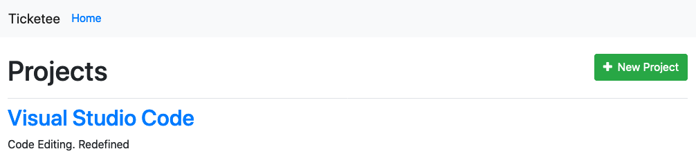
The next thing that we can style is our flash messages that appear. If you create another project in the Ticketee application, you can see how plain they are:

To make these stand out more, we’re going to apply Bootstrap’s alert styling
to it. Let’s open app/views/layouts/application.html.erb and change this
code:
<% flash.each do |key, message| %>
  <div><%= message %></div>
<% end %>
To this:
<% flash.each do |key, message| %>
  <div class="alert alert-<%= key %>">
    <%= message %>
  </div>
<% end %>
The alert class for each piece of the flash will make this object stand
out more, and the alert-<%= key %> will use another class called alert-notice
or alert-alert to color the flash message box a different color. If
we look at Bootstrap’s documentation for their alerts
(http://getbootstrap.com/components/#alerts), we can see that alert-notice
and alert-alert are not available:
In that example, we can see two that look like the kind of thing we want:
alert-success and alert-danger. We can make our alert-notice and alert-alert
classes use the stylings of these two other classes with this code added to
app/assets/stylesheets/application.css.scss:
.alert-notice {
  @extend .alert-success;
}

.alert-alert {
  @extend .alert-danger;
}
When an alert with the class attribute of alert-notice is displayed, it
will be styled as if it had a class attribute of alert-success. This is
thanks to the @extend directive in Sass, which we used earlier with the
"New", "Edit" and "Delete" links.
When we create a project again, we should see a much nicer styled flash messages:

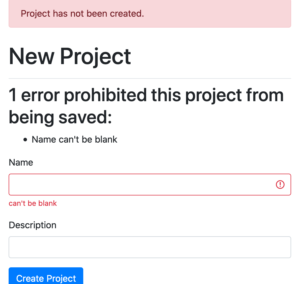
That’s much nicer! Let’s see what it looks like when we force a validation error by not entering a name for a new project:

That’s looking good too! That’s all for our flash stylings. We’re making some really good progress.
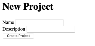
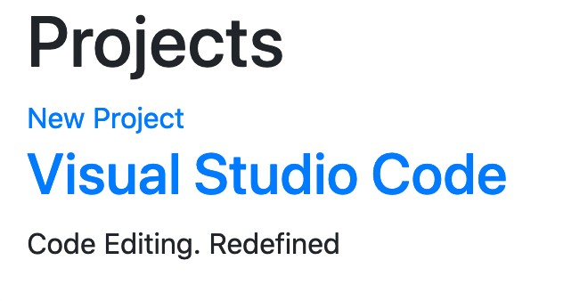
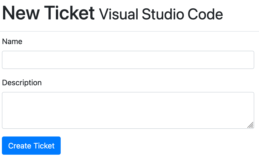
The next thing we’ll do is re-style our projects form to take it from this:
To this:
Using Bootstrap Form
To change the form to its new styling, we’re going to enlist the help of another gem called bootstrap_form, which provides not only a shorter syntax for rendering forms, but also has Bootstrap integration. Let’s add this gem now:
bundle add bootstrap_form -v 4.5.0Next, you’ll need add the import line for this gem to application.scss:
@import "rails_bootstrap_forms";Next, we can change our forms to use this new gem. We’ll do both the projects and tickets form.
Updating the styling of the project form
Over in app/views/projects/_form.html.erb, let’s change this code:
<%= form_with(model: project, local: true) do |form| %>To this:
<%= bootstrap_form_with(model: project, local: true) do |form| %>This will tell the view to use the form builder from Bootstrap Form, rather than the one that’s built into Rails. Next, we can simplify the code used for rendering the name and description fields for our project form, turning it from this:
<div>
  <%= form.label :name %>
  <%= form.text_field :name %>
</div>

<div>
  <%= form.label :description %>
  <%= form.text_field :description %>
</div>

<%= form.submit %>
To this:
<%= form.text_field :name %>
<%= form.text_field :description %>

<%= form.primary %>
We don’t need to use the surrounding <div> tags any more or to provide the
labels for the fields. Bootstrap Form takes care of all of that for us with the
input helper. It also generates a button for us using its primary helper
which operates similarly to the old f.submit method, but styles it using
Bootstrap’s default styles — adding a btn and btn-primary class.
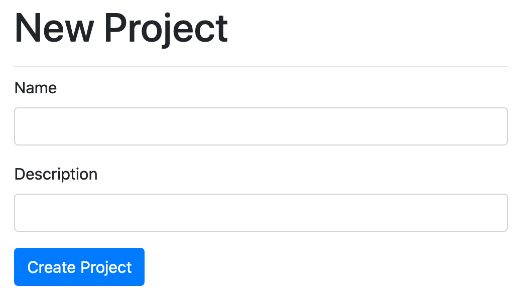
If you refresh the form page now, the form will now look like this:
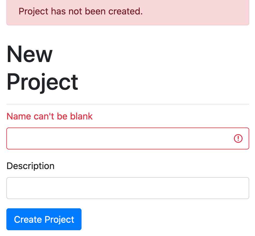
It’s looking good. But if you submit the form with some validation errors, you’ll get a nasty shock:
We now have two sets of error messages, one styled, and one not! We only put one
set of errors on the page - the top "1 error prohibited this message from being
saved" set. The second set of errors, next to the fields they relate to, are
provided by the bootstrap_form gem. They’re easier for users to understand -
if you had a long form and you wanted to know which fields you have errors for,
it might require scrolling up and down. So we can just use the errors from
bootstrap_form, and delete the error messages we added.
Open up app/views/projects/_form.html.erb, and delete the whole errors block
so that it just looks like this:
<%= bootstrap_form_with(model: project, local: true) do |form| %>
  <%= form.text_field :name %>
  <%= form.text_field :description %>

  <%= form.primary %>
<% end %>
The code is much simpler than the original form partial we started off with, and the unsightly double errors are now gone!
This has an unfortunate side effect though, as you’ll see if you run the spec
for creating projects, with bundle exec rspec spec/features/creating_projects_spec.rb:
1) Users can create new projects when providing invalid attributes
   Failure/Error: expect(page).to have_content "Name can't be blank"
     expected to find text "Name can't be blank" in "Project has not
     been created. New Project * Namecan't be blank Description"
Oops. We were checking for the presence of an error message that we just
deleted, and by default bootstrap_form displays shortened error messages, such
as "can’t be blank". Luckily, it’s easy to configure Bootstrap Form to use full
error messages that include the name of the field.
We can do this by changing our form to this:
<%= bootstrap_form_with(model: project, local: true, label_errors: true) do |form| %>
  <%= form.text_field :name %>
  <%= form.text_field :description %>

  <%= form.primary %>
<% end %>
This will make the error now appear in the label instead of underneath the input:
This will also fix the broken spec - you can verify this by running
bundle exec rspec spec/features/creating_projects_spec.rb:
2 examples, 0 failures
Great! Now all of the project pages in our application are looking good.
Updating the styling of the ticket form
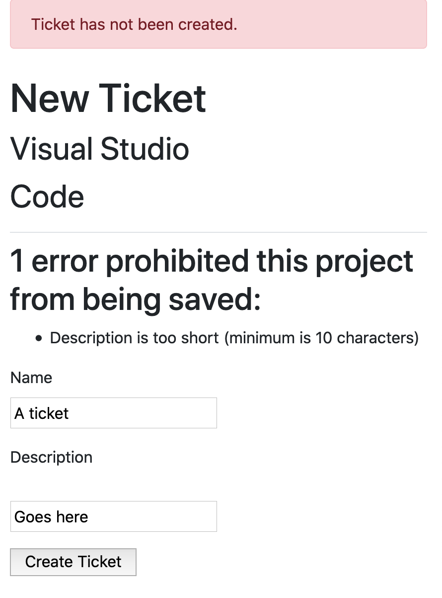
Our ticket form is currently not styled the same way as our project form:
To fix this, we’ll change the ticket form partial from this:
<%= form_with(model: [project, ticket], local: true) do |form| %>
  <% if ticket.errors.any? %>
    <div id="error_explanation">
      <h2><%= pluralize(ticket.errors.count, "error") %>
      prohibited this project from being saved:</h2>

      <ul>
        <% ticket.errors.full_messages.each do |msg| %>
          <li><%= msg %></li>
        <% end %>
      </ul>
    </div>
  <% end %>
  <p>
    <%= form.label :name %><br>
    <%= form.text_field :name %>
  </p>
  <p>
    <%= form.label :description %><br>
    <%= form.text_area :description %>
  </p>
  <%= form.submit %>
<% end %>
To this:
<%= bootstrap_form_with(model: [project, ticket], local: true, label_errors: true) do |form| %>
  <%= form.text_field :name %>
  <%= form.text_area :description %>

  <%= form.primary %>
<% end %>
This form will now look like this:
Great!
Adding a navigation bar
We’ll do one more thing and then wrap up here: add a navigation bar to the top of our application’s layout. It will look like this:
This is by far the easiest part of the Bootstrap work that we’ve done so far;
all we need to do is to add this content above the flash messages (above the
<div class="container-fluid"> in our application’s layout):
<nav class="navbar navbar-expand-lg navbar-light bg-light">
  <%= link_to "Ticketee", root_path, class: "navbar-brand" %>
  <button class="navbar-toggler" type="button" data-toggle="collapse" data-target="#collapse" aria-controls="collapse" aria-expanded="false" aria-label="Toggle navigation">
    <span class="navbar-toggler-icon"></span>
  </button>

  <div class="collapse navbar-collapse" id="collapse">
    <ul class="navbar-nav mr-auto">
      <li class="nav-item <%= "active" if current_page?("/") %>">
        <%= link_to "Home", root_path, class: "nav-link" %>
      </li>
    </ul>
  </div>
</nav>
The navbar contains two different parts: a header and the navigation itself.
The header contains a link which shows the "Ticketee" text, and when that
link is clicked it will take the user back to the homepage. In the navigation,
we add a "Home" link, just in case people don’t realise that clicking
"Ticketee" will take them back to the homepage. If the user is currently at
the / path, then an extra class called active is added to the li for
that link, turning it a different colour.
If you go to the application’s homepage, you’ll now see the navbar:
We’ve also elected to use the responsive navbar, meaning that it will display nicely on both large and small screens. You can test this out by resizing your browser, wider and smaller. When the window gets below 990px wide, the navbar will automatically switch to its "small" display:
It looks good! But the button at the top-right, which is supposed to cause the menu to expand, doesn’t work yet - it uses JavaScript to show and hide the menu contents, and we haven’t included Bootstrap’s JavaScript into our application yet. If you click that button, nothing will happen at the moment.
Like we included Bootstrap’s CSS into our application.css.scss file, we also
need to include its JavaScript. Open up app/javascript/packs/application.js,
and check out what it looks like. We haven’t modified it yet, so at the bottom
it will have four important lines:
application.js filerequire("@rails/ujs").start();
require("turbolinks").start();
require("@rails/activestorage").start();
require("channels");These lines require all the main JavaScript features that Rails uses. We won’t concern ourselves with these yet. We’ll look into some of them later on.
All that we need to do here is to add Bootstrap’s JavaScript:
require("bootstrap");Next up, we will need to add Bootstrap’s JavaScript dependencies, which we do by running this command in our terminal:
yarn add bootstrap popper.js jquery
The popper.js and jquery JavaScript packages are other packages that
Bootstrap relies on for its functionality. When these packages are installed, we will need to add require lines for these to application.js too:
import 'jquery'
import 'popper.js'
import 'bootstrap'
Now when you refresh your browser, and press the little three-bar icon[7] the menu should expand and contract, like in the following screenshot:
While the navbar is a little bare at the moment, we will be filling it out in future chapters.
More responsive styling
We’ve fixed the top navigation bar to be fully responsive, but it would be great if our whole app looked great on-the-go, from a mobile phone, tablet, or any other device. Let’s look at implementing that now.
The first thing we need to do is include a special meta tag in our document, to
ensure that responsive styles get picked up by mobile devices. Without this tag,
you’d see the same layout as you do on a desktop, just very very small to fit
on the smaller screens.
Add the following line of text just inside the <head> section of the page, in
app/views/layouts/application.html.erb:
<meta name="viewport" content="width=device-width, initial-scale=1">Some background information on this meta tag can be found on the Mozilla
Developer Network[8].
For now, we don’t have to know exactly how it works, but now we know that it
does work - our mobile browser won’t artificially pretend it has more pixels
than it has, to render larger layouts in smaller spaces.
Now our pages will use properly responsive styles on mobile. The way this works is with a CSS feature called media queries. Bootstrap uses media queries internally for lots of things, like the navbar styles we looked at earlier. If the screen is larger, the links in the bar appear in a line; if its smaller, they appear hidden, but then on their own line when revealed. We can do a similar sort of thing, using Bootstrap’s own defined styles.
Here’s what our project page will look like on an iPhone:
Whew, that was a lot of styling work! That completes all of our Bootstrap additions for the time being. Throughout the remainder of the book, we’ll be using features of Bootstrap as they’re needed to improve the design of our application, but we’ve got the basic foundation in place.
Let’s commit and push our recent changes now:
$ git add .
$ git commit -m "Added Bootstrap for styling"
$ git push