Styling the application
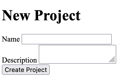
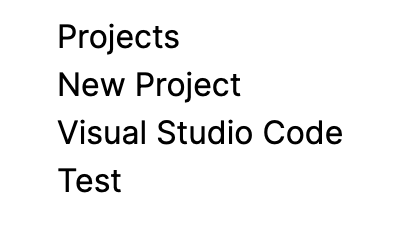
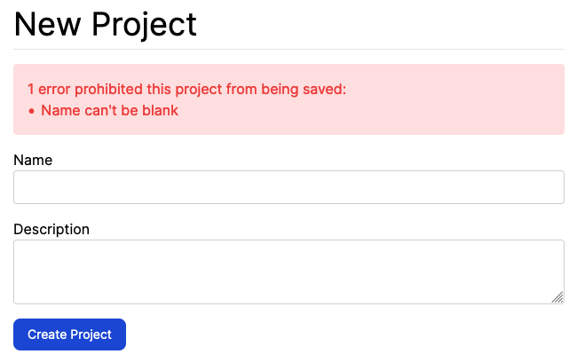
In this chapter, we’re going to take a little break from normal Rails things to improve how the application looks. The application is currently looking very plain:
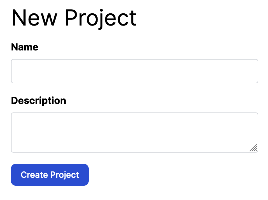
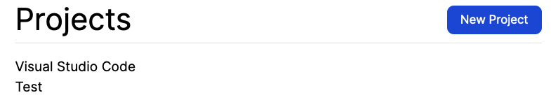
We can change this by using Tailwind[1], which is a utility-first CSS framework that provides us with a litany of classes that we can use to style the parts of our application. Once we’re done with this chapter, we’ll have our project form looking like this:
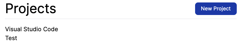
We’ll also be improving other parts of our application too: we’ll be styling the flash notices that appear:
We’re going to be using Tailwind throughout this chapter to make these changes. We could pick any CSS framework, but we picked this one due to personal preferences. Rails itself does not provide an opinionated way of approaching CSS — it instead prefers to stick to providing opinionated ways of writing a Ruby web application instead. So we have to look elsewhere, and Tailwind is where we will be looking.
Let’s get started!
Installing Tailwind
The first thing that we need to do is to install the tailwindcss-rails gem, which comes with everything that we need to start using Tailwind with our Rails application.
Let’s add this gem to our application now by running this command:
bundle add tailwindcss-rails -v "~> 2.0"
After this gem has been added, we can then run a generator that the gem provides to setup the things we need for Tailwind:
rails tailwindcss:install
Amongst other things, this generator will set up Tailwind’s configuration (config/tailw) an application.tailwind.css file for us:
@tailwind base;
@tailwind components;
@tailwind utilities;
/*
@layer components {
.btn-primary {
@apply py-2 px-4 bg-blue-200;
}
}
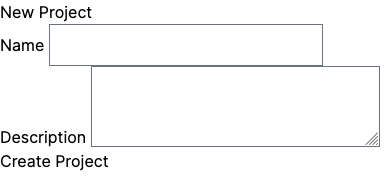
*/This is where we will be putting some styles for our application in just a few moments. Before we do that, we’ll take a look at our new project form now. Here’s what we’ll see:
This may seem like we’ve gone backwards. The header is too small. The "Create Project" button no longer looks like a button. It’s all hard up against the left side of the page, too. This is happening because Tailwind resets the styles of all elements back to their basic forms. We can progressively add styling back to these elements.
To start with, we’ll add a new <div> tag inside the <body> so that our content is pushed away from the top and side margins of the page. We’ll make this change in app/views/layouts/application.html.erb:
<body>
  <div class="my-4 mx-8 md:mx-32 lg:mx-64 ">
    <% flash.each do |key, message| %>
      <div><%= message %></div>
    <% end %>

    <%= yield %>
  </div>
</body>
When we start using Tailwind, it can feel like we’re just pressing random letters, dashes and numbers to get things done with Tailwind’s classes. After a while, the characters start making a bit of sense. Let’s run through these classes that we’ve used here:
-
my-4: Provides a vertical ("y") margin of size 4. -
mx-8: Specifies that the base horizontal ("x") margin of this page size 8. -
md:mx-32: Specifies that, on medium sized ("md") screens, the horizontal margin is size 32 instead. -
lg:mx-64: The same as above, but for large ("lg") screens, the margin size is 64.
To use these styles, we need to run a command to re-build our Tailwind CSS file:
rails tailwindcss:build
The file this command builds is at app/assets/builds/tailwind.css, and will be the result of this "build" step. Don’t try and read it all: it’s all compressed CSS!
What’s important about this generated file is that it only includes the CSS rules for the most basic Tailwind features and the classes that we’re using, and nothing else. Other CSS frameworks, while modular in nature, can lead to really large CSS files, increasing the size of files that your users need to load when they visit your application.
Tailwind’s better here, as it generates a smaller CSS file. A smaller CSS file will mean faster load times, which will be better for your users.
The margin classes that we’re using here will move the content away from the top and sides of the page. We would include screenshots here of the page itself in its various screen sizes, but it would be much more fun for you if you loaded up http://localhost:3000/projects/new and tried re-sizing your browser window’s width instead! Watch the margin grow as the width of your window changes.
Why do we care about this? Because in this day and age, we aren’t guaranteed that our users will access our applications from big desktop computers or even laptops. They could be accessing things on a phone or tablet device too. By making our page respond to these different screen widths, we can provide a better user experience.
Rolling out Tailwind styles to our application
|
Run the Tailwind watcher!
To ensure that our compiled Tailwind CSS is kept up-to-date with the styles that we’re about to use, we’ll run a different command that will keep a watch on things within this application, and will re-compile the Tailwind CSS file any time our application changes. That command is: rails tailwindcss:watch The remainder of this chapter assumes you’re either running that command, or diligently running |
|
Not sure what a Tailwind class is doing? The Tailwind documentation will help!
If you’re confused by all the The search feature of the Tailwind documentation is brilliant, and the documentation examples are very clear too. This documentation is a very strong contributor to why we, the authors, recommend Tailwind as the CSS framework used in this book. |
The root page of our application is the template at app/views/projects/index.html.erb. After bringing in Tailwind to this application, it looks like this:
Not looking too great at the moment! We’ll start fixing this up by making our <h1> big again:
<div class="border-b pb-2">
  <h1 class="text-4xl">Projects</h1>
</div>
It adds some nice spacing around the important header, and an underline. So far so good. Now we can look at the actions we can take on this page - the most obvious action is to create a new project, so we’ll make our "New Project" link stand out.
Ultimately, we want to make the "New Project" be part of the page header, and we’ll put it on the right hand side to give the page a bit of balance.
In app/views/projects/index.html.erb, change the code from this:
<div class="border-b pb-2 mb-4">
  <h1 class="text-4xl">Projects</h1>
</div>

<%= link_to "New Project", new_project_path %>
To this:
<div class="border-b pb-2 mb-4 flex items-center">
  <h1 class="text-4xl">Projects</h1>

  <ul class="ml-auto">
    <li><%= link_to "New Project", new_project_path,
      class: "text-white bg-blue-700 rounded-lg text-sm px-4 py-2" %></li>
  </ul>
</div>
This will now make the header of the page look like this:
Now, this looks an awful lot like we’re mixing a lot of HTML and CSS together into some not-so-delicious code soup. And it’s seeming likely that we’re going to be repeating these CSS classes on a few different pages. So what are we going to do about that? Well, we can move these classes elsewhere.
Tailwind CSS and @apply
A while back, we mentioned a file called app/assets/stylesheets/application.tailwind.css. This file is the source of all our Tailwind styles and it does this by using this code:
@tailwind base;
@tailwind components;
@tailwind utilities;

/*

@layer components {
  .btn-primary {
    @apply py-2 px-4 bg-blue-200;
  }
}

*/
The commented-out code here shows how we might create a custom btn-primary class, and it uses a Tailwind-specific CSS directive called @apply to do that. This btn-primary class would then become an aggregation of the py-2, px-4 and bg-blue-200 Tailwind styles.
We intentionally did not mention @apply earlier, as we need to experience the pain of not using @apply before we can understand why we would want to use it. If we did not have @apply, any time we wanted a nice rounded blue button, we would have to use all of these classes:
text-white bg-blue-700 rounded-lg text-sm px-4 py-2
text-white bg-blue-700 hover:bg-blue-800 focus:ring-4 focus:ring-blue-300 font-medium rounded-lg text-sm px-5 py-2.5 mr-2 mb-2 dark:bg-blue-600 dark:hover:bg-blue-700 focus:outline-none dark:focus:ring-blue-800
But with @apply, we can group these utility classes together and use a single class to represent multiple ones. Let’s see how we can do this now. We’ll change the content of app/assets/stylesheets/application.tailwind.css to this:
@tailwind base;
@tailwind components;
@tailwind utilities;


@layer components {
  .button-primary {
    @apply text-white bg-blue-700 rounded-lg text-sm px-4 py-2
  }
}
By doing this, we can make our button back on app/views/projects/index.html.erb this instead:
<ul class="ml-auto">
  <li><%= link_to "New Project", new_project_path,
    class: "button-primary" %></li>
</ul>
Isn’t that much nicer? Now we can use button-primary instead of all of those CSS class names to have a nice rounded blue button.
It’s worth pointing out here that @apply will work for any CSS rule. Let’s say that we want to have particular styles for hover states on these buttons. We can acheive this by putting this code inside @layer components back in the Tailwind CSS file:
@tailwind base;
@tailwind components;
@tailwind utilities;


@layer components {
  .button-primary {
    @apply text-white bg-blue-700 rounded-lg text-sm px-4 py-2 hover:bg-blue-800 focus:ring-2 focus:ring-blue-300;
  }
}
This will then apply a darker blue color to the button whenever it’s hovered:
And if the button is focussed, it will have a small light-blue ring around it:
That’s the button itself, but we can also tidy up the styles of the header here too. Let’s change the view to this:
<div class="header">
  <h1>Projects</h1>

  <ul class="actions">
    <li><%= link_to "New Project", new_project_path,
      class: "button-primary" %></li>
  </ul>
</div>
And we’ll add new classes for header and actions to the Tailwind CSS file:
@tailwind base;
@tailwind components;
@tailwind utilities;


@layer components {
  ...

  .header {
    @apply border-b pb-2 mb-4 flex items-center
  }

  .header h1 {
    @apply text-4xl
  }

  .header .actions {
    @apply ml-auto;
  }
}
This tidies up our view and makes our CSS classes re-useable across our application. As we go through the remainder of this chapter, we’ll find other useful abstractions like this too.
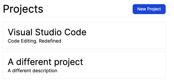
Before we finish up our work on this page, we should take a look at the list of projects as well at the bottom, which is currently unstyled.
Let’s apply some Tailwind classes to the elements that make this up now in `app/views/projects/index.html.erb:
<div class="projects space-y-2">
  <% @projects.each do |project| %>
    <div class="rounded border p-4">
      <h2 class="text-3xl"><%= link_to project.name, project %></h2>
      <p><%= project.description %></p>
    </div>
  <% end %>
</div>
This will make the list of projects appear styled:
We’re not currently anticipating using these styles elsewhere, and they’re fairly short, and so we’ll keep them in this file rather than moving them back to application.tailwind.css.
One change that we should make to application.tailwind.css is a change to make those links in those project boxes appear more obviously like links. Right now, they’re black text and do not visually hint at all that they’re clickable (unless you hover over them). Let’s fix this up for all links in this application:
@layer components {
  a {
    @apply text-blue-700
  }

  /* ... */
}
This will apply the same blue colour from the primary button to all links within this application. Here’s what that will look like:
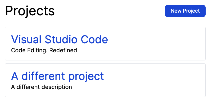
That’s looking so much better!
Let’s make a commit here:
git add .
git commit -m "Added Tailwind and base styles to the application"
git push
Next up, let’s look at how to style the project form.
Styling forms with Tailwind
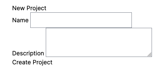
Our project form is looking very un-styled at the moment!
Let’s apply some Tailwind classes here to make things look a lot better. We already have a header class that we can apply to make the top of this page look better. Let’s use that now:
<div class="header">
  <h1>New Project</h1>
</div>
This will turn our header into this:
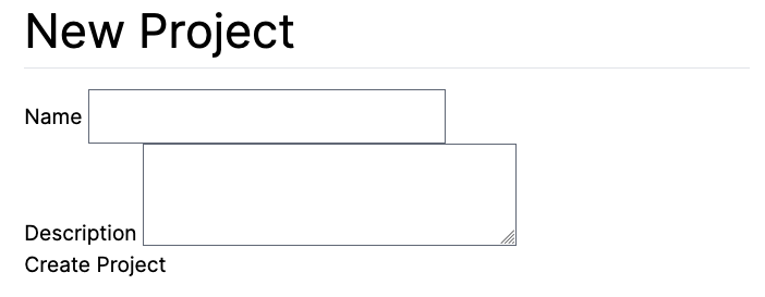
That was the easy part. Now the trickier part is applying styles to the form itself.
<%= form_with(model: project, local: true, class: "space-y-4") do |form| %>
  <% if project.errors.any? %>
  <div id="error_explanation">
    <h2><%= pluralize(project.errors.count, "error") %>
    prohibited this project from being saved:</h2>

    <ul>
      <% project.errors.full_messages.each do |msg| %>
        <li><%= msg %></li>
      <% end %>
    </ul>
  </div>
  <% end %>
  <% input_classes = "bg-gray-50 border border-gray-300 text-gray-900 text-sm rounded block w-full p-2" %>
  <div>
    <%= form.label :name, class: "block mb-2 font-bold" %>
    <%= form.text_field :name, class: input_classes %>
  </div>

  <div>
    <%= form.label :description, class: "block mb-2 font-bold" %>
    <%= form.text_area :description, class: input_classes %>
  </div>

  <%= form.submit class: "button-primary" %>
<% end %>
This is what our form will look like now:
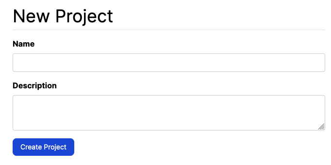
From the top, we’ve used space-y-4 to space out each field in this form with a size of 4. Without this, our fields would look squished together.
We’ve on-purpose not styled the error messages yet, we’ll look at them in a moment.
After those, we’ve defined a Ruby variable called input_classes to store the big list of classes that are then applied to the text field and text area. These are a good candidate to be moved out to application.tailwind.css!
Finally, for the labels themselves we use block mb-2 font-bold to make them stand out a bit better.
We shouldn’t stop here though. It’s likely that we’ll need those input and label classes in other forms, in particular the one over in app/views/tickets/_form.html.erb! So let’s move all of these styles out to application.tailwind.css now.
@layer components {
  /* ... */
  .form {
    @apply space-y-4
  }

  .input {
    @apply border border-gray-300 text-gray-900 text-sm rounded block w-full p-2
  }

  .input:focus {
    @apply ring-blue-500 border-blue-500;
  }

  .form label {
    @apply block mb-2 font-bold
  }

  .form input[type=text],
  .form textarea {
    @apply input;
  }

  .form input[type=submit] {
    @apply button-primary;
  }
}
In this file, we’ve now added a new class called .form that will serve as the basis for styling form elements in this application.
We’ve added a specific rule for label elements within .form elements that applies the block, mb-2 and font-bold classes, and this will mean we won’t need to mention these in the view.
We’ve added two rules at the bottom here to style text and textarea inputs according to the rules defined in the input class. This will mean that we can remove the input_classes variable definition in the view too.
By abstracting these classes back to the CSS file, it allows us to massively simplify the view. Let’s change that project form to this:
<%= form_with(model: project, local: true, class: "form") do |form| %>
  <% if project.errors.any? %>
  <div id="error_explanation">
    <h2><%= pluralize(project.errors.count, "error") %>
    prohibited this project from being saved:</h2>

    <ul>
      <% project.errors.full_messages.each do |msg| %>
        <li><%= msg %></li>
      <% end %>
    </ul>
  </div>
  <% end %>
  <div>
    <%= form.label :name %>
    <%= form.text_field :name %>
  </div>

  <div>
    <%= form.label :description %>
    <%= form.text_area :description %>
  </div>

  <%= form.submit %>
<% end %>
Our form will maintain its existing style:
Great stuff!
There’s two more thing we’ll need to style here — and that’s the validation error messages at the top of the form, as well as the flash message itself at the top of the page. Let’s handle the error messages first. We’ll change that block of code to use a class of errors instead of an id of error_explanation:
<% if project.errors.any? %>
  <div class="errors">
    <h2><%= pluralize(project.errors.count, "error") %>
    prohibited this project from being saved:</h2>

    <ul>
      <% project.errors.full_messages.each do |msg| %>
        <li><%= msg %></li>
      <% end %>
    </ul>
  </div>
<% end %>
Then we can style this error box using this code over in application.tailwind.css:
@layer components {
  /* ... */

  .form .errors {
    @apply p-4 bg-red-100 text-red-500 rounded;
  }

  .form .errors ul {
    @apply list-disc list-inside
  }
}
When our form is invalid, this is what it will look like:
A couple of short styles really makes our errors stand out from the rest of the form!
Now, let’s tackle that flash notice that appears at the top too. We’ll do this by changing the code that is responsible for rendering the flash messages in app/views/layouts/application.html.erb:
<% flash.each do |key, message| %>
  <% style_class = key == :notice ? "flash-notice" : "flash-alert" %>
  <div class="<%= style_class %> mb-4"><%= message %></div>
<% end %>
We’ve changed this code to define a style_class variable now. You might notice something about this code. It’s more complicated than taking the string "flash-" and appending the key to the end of that to make either flash-notice or flash-alert. So why do it this long way?
We’re doing it this long way because if we wrote code like this:
<%= "flash-#{key}" %>
Tailwind’s compilation step would miss that the resulting class could either be flash-notice or flash-alert, and so it wouldn’t see that class in the application at all. This would then cause the compiler to not include either a flash-notice or flash-alert class because, according to the compiler, neither of those classes are being used. So when we’re using Tailwind, we should always refer to the full class name and not attempt to build up dynamic class names.[2]
Let’s add styles for both flash-notice and flash-alert to application.tailwind.css now:
@layer components {
  /* ... */

  .flash {
    @apply rounded mb-4
  }

  .flash-notice {
    @apply flash bg-green-100 text-green-500
  }

  .flash-alert {
    @apply flash bg-red-100 text-red-500
  }
}
This will now make our alert flash appear with a similar style to the validation messages from the form:
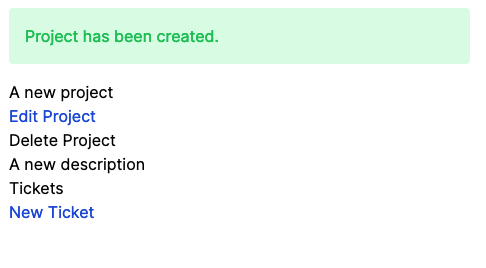
And when we fill out the form with valid information, we’ll see a beautifully styled flash notice, on top of a not-so-beautiful projects show page:
We’re now done with styling the form as much as we can. We’ve applied some sensible defaults to any form that is defined with a form class, and we will be able to re-use these styles anywhere else. One place that they’re already used is over on the edit page for projects: http://localhost:3000/projects/1/edit.
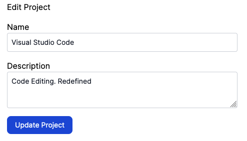
The only thing on this page that’s not styled is the header itself. We can fix this by going into app/views/projects/edit.html.erb and changing the header to this:
<div class="header">
  <h1>Edit Project</h1>
</div>
This will now change the header of this page to use the same style as the one on the "New Project" page:

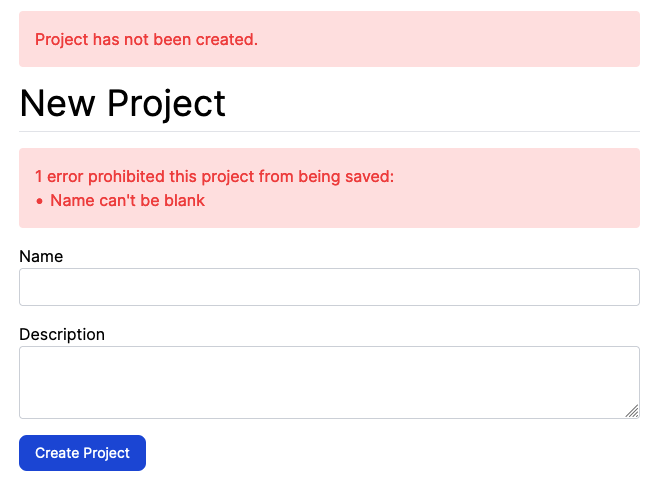
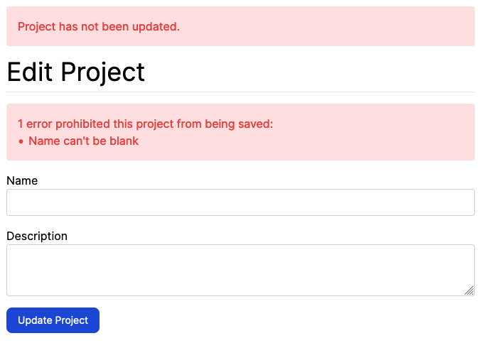
If we submit this form with a blank name for the project, we’ll see the same styled flash message and validation messages that our form for creating projects had:
We’ve now styled the two forms for projects by using Tailwind. We’ve seen how we could use class names in the HTML view files themselves to apply the styles. When the styles were used in a few different places, we extracted them into application.tailwind.css so that we use a simpler class to represent all those same styles.
We’ll make a commit here for these changes now:
git add .
git commit -m "Styled project forms and flash notices"
git push
Our next task will be styling the project show page.
Styling the projects show page
Just like our index view, and form views before it, the view at app/views/projects/show.html.erb is currently un-styled too.
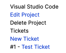
Let’s start by fixing the header of this page:
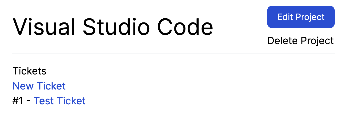
<header class="header">
  <h1><%= @project.name %></h1>

  <div class="actions">
    <%= link_to "Edit Project", edit_project_path(@project), class: "button-primary" %>
    <%= button_to "Delete Project",
        project_path(@project),
        method: :delete,
        remote: true,
        form: { data: { turbo_confirm: 'Are you sure?' } }
    %>
  </div>
</header>
We’re re-using the header and button-primary classes here to style the header of this page to match the other parts of our application. While we’ve styled the "Edit Project" link, we have not applied any such styling to the "Delete Project" button:
We’ve not had to style a "Delete" button before! Such a button should be coloured differently from the primary actions of our users as a way of warning them that the action that they would take by clicking this button is a destructive action. Let’s add a new class for this to application.tailwind.css now:
@layer components {
  /* ... */
  .button-danger {
    @apply text-white bg-red-600 rounded-lg text-sm px-4 py-2
  }
}
Besides the red background colour (bg-red-600), the classes used for this button are identical to the ones that we used for button-primary. Let’s see them side-by-side:
.button-primary {
  @apply text-white bg-blue-700 rounded-lg text-sm px-4 py-2
}

.button-danger {
  @apply text-white bg-red-600 rounded-lg text-sm px-4 py-2
}
We can tidy this up by crerating a button class that applies the common styles:
.button {
  @apply text-white rounded-lg text-sm px-4 py-2
}

.button-primary {
  @apply button bg-blue-700
}

.button-danger {
  @apply button bg-red-600
}
That’s a bit better! We’ve also added some styles previously for the hover and focus states of the primary button. We should add some similar styles for the danger button too:
.button-danger {
  @apply button bg-red-600
}

.button-danger:hover {
  @apply bg-red-800;
}

.button-danger:focus {
  @apply ring-2 ring-red-300;
}
When we’ve added these styles, our buttons will look like this:
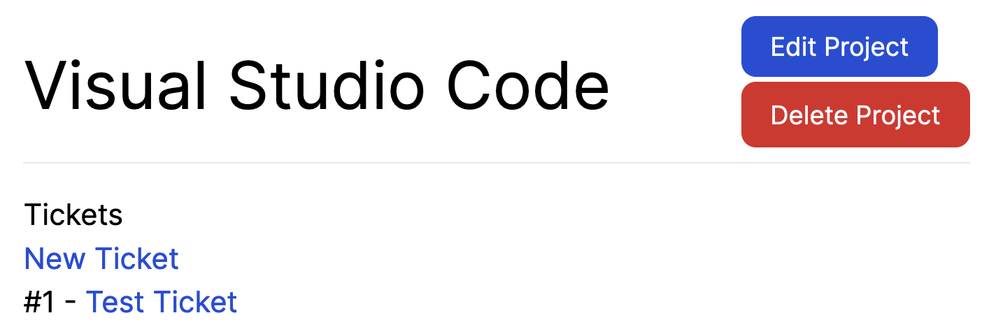
That looks a lot better!
One small tweak we could make here to the buttons is to make them the same width and to align their text in the middle of the button. We can do this by adding two new classes to the end of our class list of .button:
.button {
  @apply text-white rounded-lg text-sm px-4 py-2 block text-center
}
The block class makes the buttons take up all the width of their containing element. The text-center moves the text of the button into the center. Here’s what we’ll end up with now:
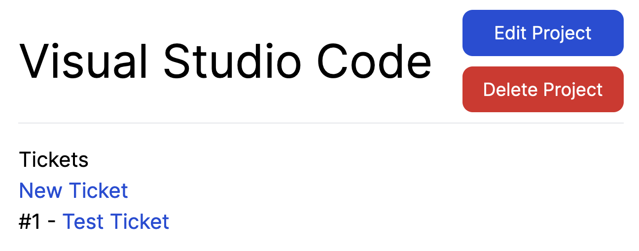
That looks a lot better with just a few small tweaks.
OK, that’s enough about the header. Let’s look at the rest of this page. There’s a second header on this page which is more of a sub-title. It’s this code:
<header>
  <h2>Tickets</h2>

  <ul class="actions">
    <li><%= link_to "New Ticket", new_project_ticket_path(@project) %></li>
  </ul>
</header>
We can apply our header class here to improve the look of this element, and add button-primary to the "New Ticket" link to make it stand out:
<header class="header">
  <h2>Tickets</h2>

  <ul class="actions">
    <li>
      <%= link_to "New Ticket",
        new_project_ticket_path(@project),
        class: "button-primary"
      %>
    </li>
  </ul>
</header>
When we make this change, this is what the whole page will now look like:
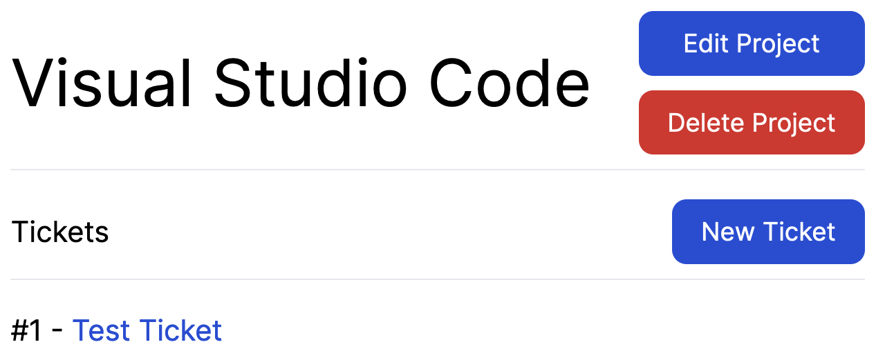
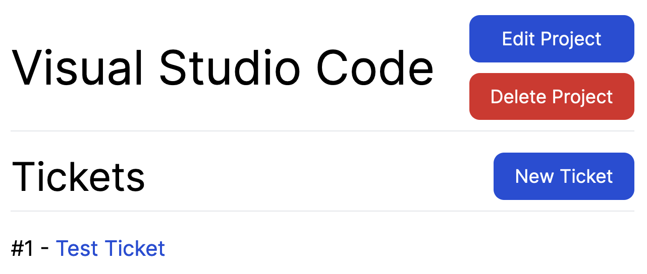
The text for "Tickets" looks a bit small however. This is because we have not styled h2 elements that are contained within .header elements. We can add a style for these to application.tailwind.css, underneath our style for h1:
.header h1 {
  @apply text-4xl
}

.header h2 {
  @apply text-3xl
}
With this change, our header will now stand out a lot more:
The list of tickets underneath this seems alright for now — as we add information to our tickets, such as who created them (Chapter 7) and what state the ticket is in (Chapter 10), we will re-visit this styling.
That finishes up our app/views/projects/show.html.erb updates. Let’s make a commit of those:
git add .
git commit -m "Update style of projects/show"
git push
Now that we’ve styled all of the projects pages, let’s move onto styling the tickets pages. We’ll start with the forms over there.
Styling the tickets forms
The great thing about how we’ve approached these styles is how we can re-use them very, very easily. We’ve spent a lot of this chapter setting a great foundation for the styles and now it’s time to reap the benefits.
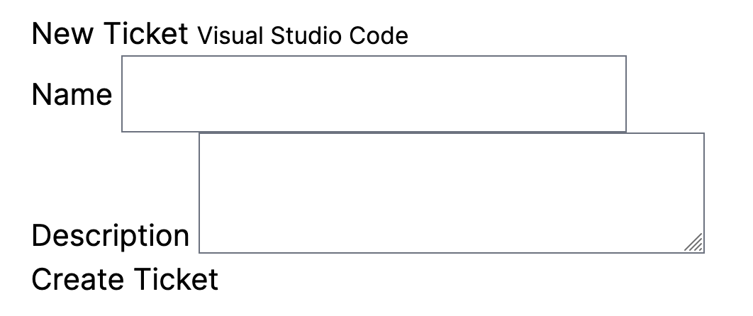
Our current tickets form is looking not so good:
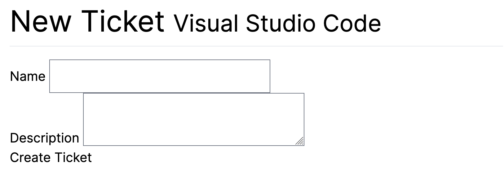
Let’s apply our styles to this form now. We’ll start at app/views/tickets/new.html.erb, and we’ll update the header there:
<header class="header">
  <h1>
    New Ticket
    <small><%= @project.name %></small>
  </h1>
</header>
This will now fix up our header:
We’ll also need to apply a similar change to the "edit" version of this form too:
<header class="header">
  <h1>
    Edit Ticket
    <small><%= @project.name %></small>
  </h1>
</header>
Onto the rest of the form! Let’s open up the form’s partial now and apply the form class:
<%= form_with(model: [project, ticket], class: "form") do |form| %>
  ...
This is the only change we need to make to this form to apply all our Tailwind styles. Refresh the page and here’s what we’ll see:
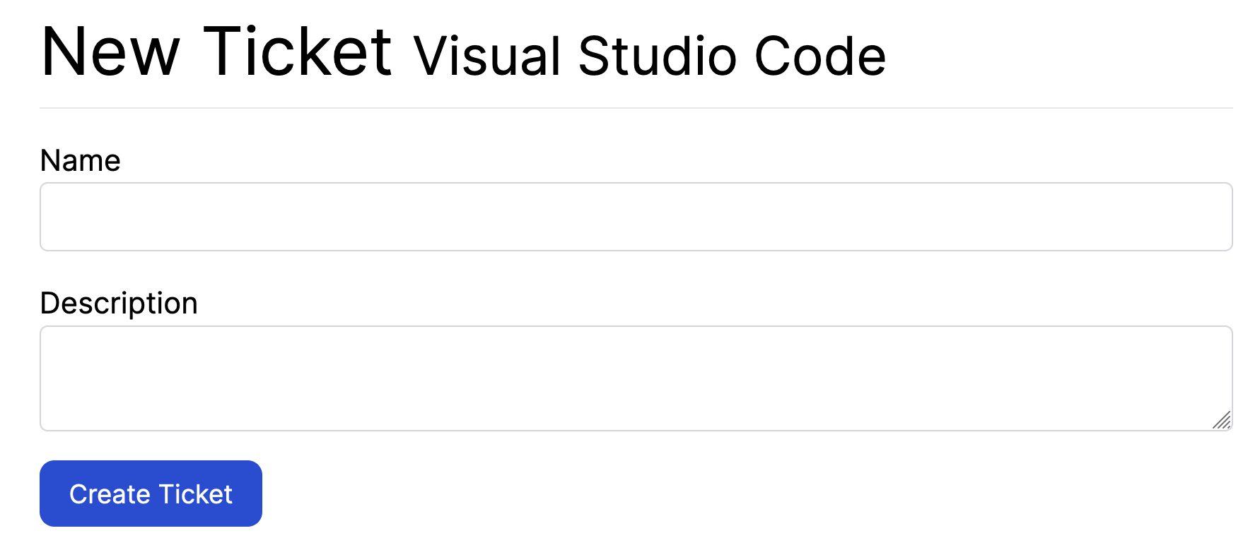
All this was made possible by our .form styles over in application.tailwind.css. See what we meant before about reaping the benefits? Because we made these abstractions earlier on, we’re now able to re-use these styles with some great advantages.
Now that we’ve updated these forms, we’ll make a commit:
git add .
git commit -m "Update ticket form styles"
git push
The final page that we need to update is the "show" page for tickets.
Styling the ticket show page
As in the last couple of sections, this page is looking quite plain:
Let’s apply our styling magic to this page now.
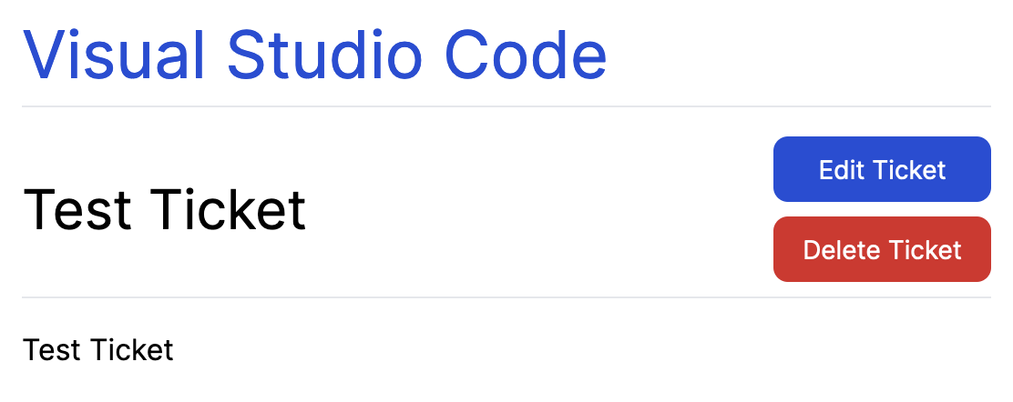
<header class="header">
  <h1><%= link_to @project.name, @project %></h1>
</header>

<header class="header">
  <h2><%= @ticket.name %></h2>

  <ul class="actions">
    <li><%= link_to "Edit Ticket", [:edit, @project, @ticket], class: "button-primary" %></li>
    <li><%= button_to "Delete Ticket", [@project, @ticket], method: :delete,
            class: "button-danger",
            form: { data: { turbo_confirm: "Are you sure you want to delete this ticket?" } } %></li>
  </ul>
</header>

<%= simple_format(@ticket.description) %>
We’ve added the header class to both of the headers here to make them stand out. Then we’ve added the button styles to the edit and delete buttons. Here’s what this page will look like now:
Well that didn’t take very long now! Let’s make a commit for that:
git add .
git commit -m "Update ticket show styles"
git push
Summary
In this chapter, you used the Tailwind CSS framework to style your Rails application. Rails itself does not provide an opinionated way of approaching CSS — it instead prefers to stick to providing opinionated ways of writing a Ruby web application instead. So we had to look elsewhere, and Tailwind is where we looked.
With the help of the tailwindcss-rails gem, we were able to set up our project with Tailwind easily, and we were able to run the rails tailwind:build command to build our CSS file once, or rails tailwind:watch to re-build that file it whenever changed.
Tailwind allowed us to specify class names such as bg-blue-700 for a blue background on a button, or border-b for a light-grey border underneath and element.
This isn’t the last we’ll see of Tailwind in this application. We’re going to continue to use it to apply styles whenever necessary going forward.
But for now, it’s time to get back to doing more Rails-y things.